Evino · Product Page
Turning taste into interface: +65% add-to-cart
How I turned the sensory attributes of wine into an accessible visual language anyone can read, including people who can't see.
- Company
- Evino · Wine e-commerce
- Platform
- Magento · web and app
- My role
- Product Designer, sole designer on the project: discovery, research, benchmarking, validation, usability testing, product review and design ops
- Team
- 2 PMs · 2 iOS · 2 Android · 2 front-end · 2 back-end · 2 QAs · 1 data scientist
- Duration
- 9 months, from discovery to production
[ Impact ]
+64.99%
add-to-cart rate
21% → 35%
conversion (peak)
1,945
survey responses in under 24h
Context
Buying wine online means buying something you can't taste. In a store, customers ask, smell, get a recommendation. Online, all that's left is an unfamiliar label and a spec sheet full of expert jargon.
Problem
Customers were leaving the product page out of uncertainty: they couldn't tell whether a wine matched their taste. The page had to serve casual buyers and specialists at once, and Evino served Brazil's largest community of blind wine lovers, so accessibility wasn't optional.
Process
- A survey with 1,945 responses in under 24 hours to understand how people choose wine.
- A benchmark of 50+ competitor features, plus Airbnb as a reference for presenting dense information lightly.
- Usability tests on every block before launch, and product review with the team once the code was ready.
Key decision: showing what you feel
Insight
Organoleptic attributes (body, acidity, tannins, sweetness) are perceived by the senses, not read. Technical terms pushed casual buyers away.
What I tested and dropped
Charts and information-heavy blocks. They looked good, but were hard to read at a glance and inaccessible to screen readers.
Decision
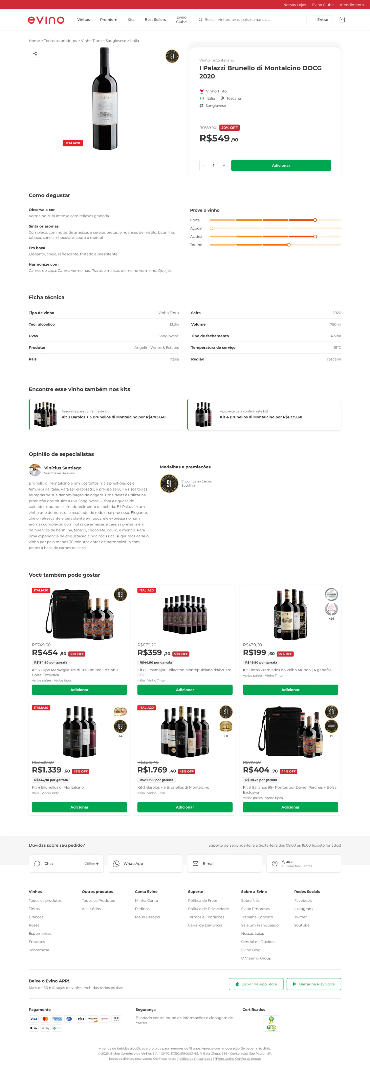
A 0-to-5 intensity scale, the same format already used in the physical world of wine. People recognize the pattern without learning anything new, and each attribute becomes plain text for screen readers ("Acidity: 4 of 5").
Solution
- Sensory attributes on a 0–5 scale
- A step-by-step "how to taste" guide
- Technical specs reordered by decision priority
- Critic and customer reviews
Result
Add-to-cart rose 64.99% over the previous page, and conversion reached 34.91% versus 21.16%. The whole funnel, from product page to purchase, improved.
The full product page
Pick a page and scroll inside the screens to see each one in full.
A single wine's page, on the website and in the app.



Accessibility isn't a layer you add at the end. When I designed for people who can't see, the interface got clearer for everyone. The 0-to-5 scale was born from that constraint, and it's what gave casual buyers confidence.