Dexco · Checkout
A checkout for home renovation: conversion from 1.1% to 3.9%
How I turned complex nationwide logistics, with orders split by ZIP code and worth up to R$ 300k, into a clear and trustworthy checkout.
- Company
- Dexco · E-commerce, focused on end consumers
- Platform
- VTEX · web
- My role
- Design lead: discovery, requirements, ideation, flow, high-fidelity UI, usability testing, reporting to the Martech board and post-launch follow-up
- Team
- Me + 1 junior designer · 1 PM · 1 front-end · 3 full stack · 1 data scientist · consulting agency
- Duration
- 6 months, from discovery to production
[ Impact ]
1.1% → 3.9%
conversion (3.5×)
R$ 70–300k
in a single order, for renovation purchases
Martech
results reported to the board
Context
Dexco sells fixtures, ceramics and flooring to people in the middle of a renovation, one of the most stressful moments in anyone's life. Its factories are spread across a continent-sized country, and products have to arrive on the construction schedule.
Problem
A single cart could turn into several deliveries, from different factories, with different lead times and shipping costs depending on the buyer's ZIP code. The checkout didn't make that clear, and nobody commits to a high-value purchase without knowing when each item arrives. And these weren't small purchases: orders of R$ 70k, 90k or 300k were common. A mistake didn't end at checkout. It became a late delivery, a delayed renovation and a complaint.
Process
- I studied how Dexco's logistics work, how VTEX splits orders and how shipping is calculated. I had to understand the system before designing the interface.
- Heatmaps, customer complaints and browsing behavior to locate the friction points.
- Usability testing before implementation, and tracking the numbers after launch.
Key decision: clarity over brevity
Insight
Everyone is used to fast, few-click checkouts. But a purchase this size demands attention: customers needed to understand and double-check every detail to trust it, not rush past them.
Decision
I built a more robust checkout, with more detailed and guided steps, so the order would be right the first time. In the delivery section, each package is numbered (Package 1/3, 2/3, 3/3) with who ships it, the products inside, the lead time and a choice between Fast or Economy delivery. Customers see how the order will reach their site before they pay.
What it prevented
A wrong order is expensive after the purchase: late deliveries, delayed renovations and complaints. A slightly longer but clear checkout prevented those problems before they happened.
Leadership
Without a solid design system, I split the work with a junior designer: I defined the flow and visual patterns, and the junior designer handled componentization and breakpoints.
Result
The new experience brought clarity, trust and guidance to high-value purchases. Conversion went from 1.1% to 3.9%.
The checkout, step by step
Pick a step and scroll inside the screens to see each one in full, on desktop and mobile.
Who is buying.
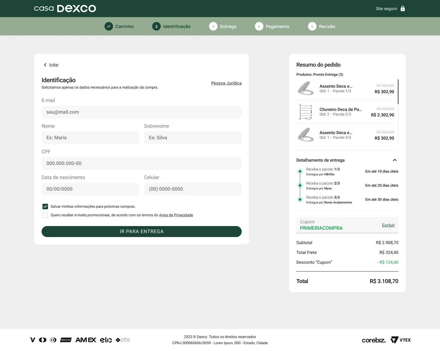

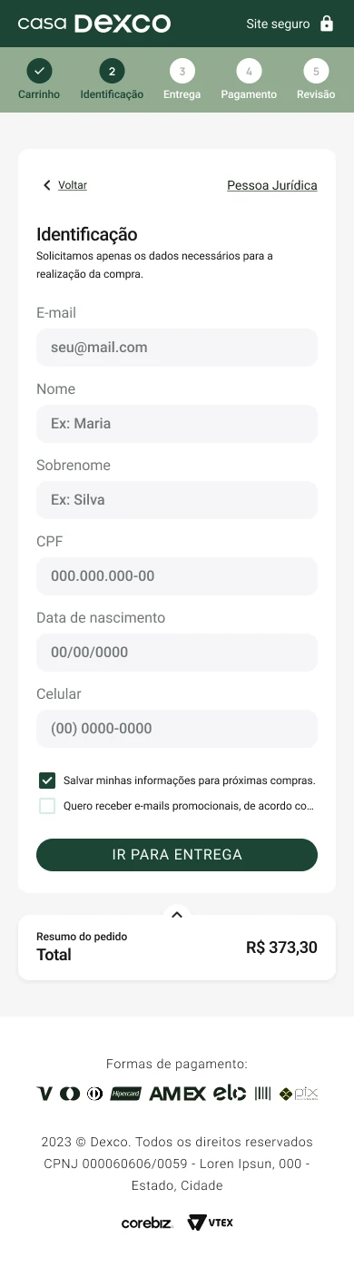

In high-value purchases, friction isn't the number of steps. It's doubt. I had to understand logistics, VTEX and shipping math before designing a single screen, and that understanding is what became clarity in the interface.